The default story templates are great for publishers who do not wish to radically change the design or functionality of the default amp story pages.
- setup is very easy
- customization is possible, but within limit
- you automatically get updates/enhancements
At the time of writing, the AMP library only supports the generic story template. But more (video, live-blog) will be added.
Customizations:
The AMP library gives you control of parts of the story page by providing various render props. You are free to build these parts of the story page using AMP library components or amphtml of your choice. Go to The 'opts' object for the API reference
1. Slots:
Slots can be thought of as windows that let you "slot in" whatever you need. In story page, we have two slots:
- top slot - placed just below the top ad
- bottom slot - placed just above the bottom ad
- live-blog-card-slot - placed after every live blog card
2. The Header Card:
Using the headerCardRender function, customize the entire header card.
Left: is the default header card. Right: custom headerCard


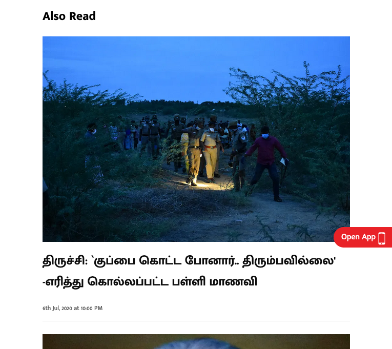
3. Related Stories:
relatedStoriesRender is the render prop for related stories
Left: default. Right: custom
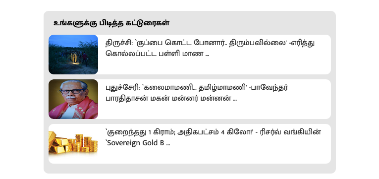
4. Infinite Scroll:
infiniteScrollRender is the render prop for infinite scroll
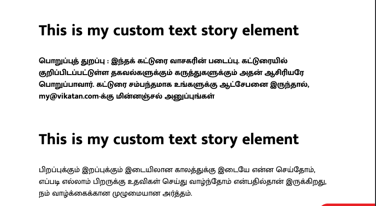
5. Story Elelemts:
You can customize story elements using story element render props.
Left: default text story element. Right: custom