How to integrate/enable visual stories for malibu apps:
- Assuming ampLib integration is already done, make sure visual stories are enabled for your account. Please talk to Quintype support for this
- Update
@quintype/frameworkto latest (v4.5.11 at the time of writing this) by runningnpm i @quintype/framework@latest - next, you need to add the route
/ampstories/*as a static route in your malibu app. To do this, go to the fileapp/server/routes.jsand add the following toSTATIC_ROUTES
{
  path: "/ampstories/*",
  pageType: PAGE_TYPE.VISUAL_STORY,
  exact: true
}
- next, go to file
app/isomorphic/constants.jsand add the following insidePAGE_TYPEobjectVISUAL_STORY: "visual-story" - That's it. You might want to enable ads on your visual stories. Please pass ad slot from
featureConfig, read on to know how.
Intro:
AMP Visual Stories consist of pages. These are in turn made up of layers containing basic amp elements. Read this for more info.
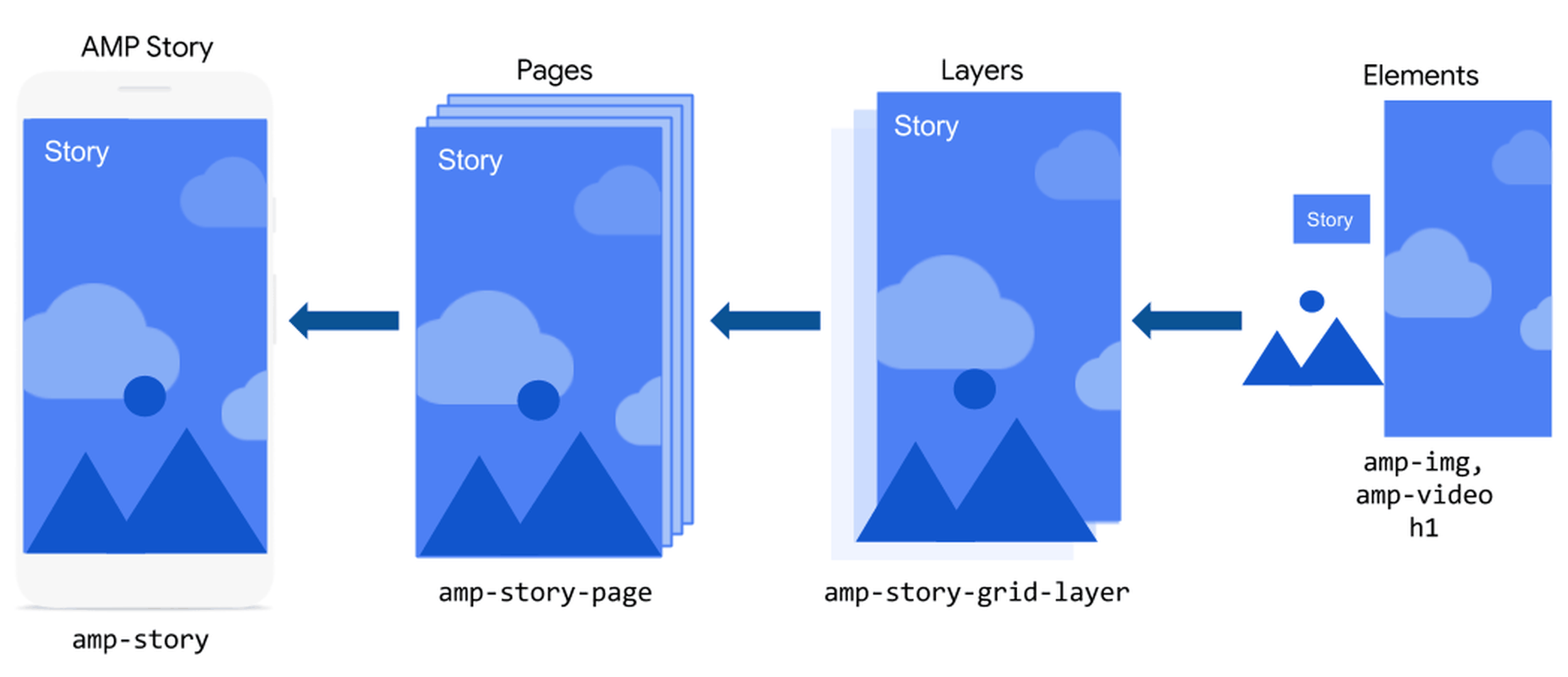
- The first visual story page shows the hero image, headline, author name, and publisher logo.
- Every subsequent visual story page corresponds to a Quintype story card (i.e. the second visual story page will show the 1st storycard).
- Only the following story elements are supported - image, title, also-read, answer, bigfact, blockquote, blurb, q-and-a, question, quote, summary, title, normal paragraph (text), CTA. All other story elements are ignored.
- At this point of time our CMS does not support uploading videos, so they're not supported by AmpLib.
- There can be only one image per story card. If more than one image is added (per card), the first one is displayed. If image caption and attribution are added, they're positioned at the bottom right with a pipe separator. We also support only Image caption/attribution. The
Rich Text Image Fieldsfeature which is available in Bold is also supported. - Similarly, there can be only one
titlestory element. - There can be one or more (or a combination of) CTA, also-read, answer, bigfact, blockquote, blurb, q-and-a, question, quote, summary, title, normal paragraph story elements. They're positioned at the bottom of the visual story page.
Customizing visual stories
By default, visual stories have no animations; just a simple image with text at the bottom. However you can add animation effects using featureConfig. Please go through these docs for choosing animation effects.
Sample featureConfig:
dummyOpts = {
  featureConfig: {
    visualStories: {
      logoAlignment: "left",
      logoUrl:
        "https://thumbor-stg.assettype.com/malibu/2021-07/eb879d94-c255-46eb-9944-dc361d3da0c0/malibu_16_svg.png",
      autoAdvanceAfter: "5s",
      ads: {
        doubleclick: {
          dataSlot: "/1009127/FOO_AMP_TOP"
        },
        adsense: {
          clientId: "KSP199948000-2",
          slotId: "1004788",
        },
        mgId: {
          widgetId: "1282689"
        }
      },
      outlinkProps: {
        theme: "custom",
        "cta-accent-element": "background",
        "cta-accent-color": "#0047FF",
        "cta-image": "none"
      },
      animation: {
        image: {
          animateIn: "zoom-in",
          animateInDuration: "120s",
          animateInDelay: "1s"
        },
        text: {
          animateIn: "fly-in-bottom",
          animateInDuration: "1s",
          animateInDelay: "1s"
        }
      }
    }
  }
};
autoAdvanceAfter: (String) Optional. Sets the time after which the page automatically advances. If omitted, the page will not automatically advance. Example: "500ms", "3s"- ad slot: (String) Optional. Example "/1009443/PUBLISHER_AMP_TOP"
featureConfig>visualStories>ads>doubleclick>dataSlotsets the ad slot for visual stories. Adsense and MGID are also supported. Ads are dynamically inserted, please read docs animation: (object) Optional.
animation>imageapplies animation props to the story image. We acceptanimateIn,animateInDurationandanimateInDelay.animation>textapplies animation props to the story text. We acceptanimateIn,animateInDurationandanimateInDelay. Refer docs.
-
logoAlignment: (string/function) Optional. Aligns the publisher logo on the cover page of the visual story. Possible values are left, center and right. If omitted it aligns the logo in the centre. -
logoUrl: (string/function) Optional. URL of a logo that will show up on the visual story. It is recommended that this logo should be of 1:1 aspect ratio. If omitted takes the default logo. -
outlinkProps: (string/function) Optional. Props to the (outlink)[https://amp.dev/documentation/components/amp-story-page-outlink/?format=stories] component. Can either be an object containing the props as key value pairs or a function that returns such an object. If nothing is passed, the default light theme will be applied for the CTA button.
eg: outlinkProps: { theme: "dark" } // sets dark theme outlinkProps: { theme: "custom", "cta-accent-color": "#0047FF", "cta-accent-element": "background"} // custom theme outlinkProps: () => { return { theme: "dark" } } // function returning props obj
NOTE :
CTA link will be opened in the same tab (Even we set it as "Open in New Tab" from BOLD).
This is a limitation in Google AMP (please refer. https://github.com/ampproject/amphtml/issues/32171)
Visual story templates:
You can also create upto three different templates for visual stories. featureConfig.visualStories can either be an object like shown above, or an array of such objects. The 0th element of this array will be the featureConfig for the 1st template, and so on. Templates can be selected using story attributes feature in BOLD.
dummyOpts = {
  featureConfig: {
    visualStories: [
      {
        logoAlignment: "left",
        logoUrl: "https://thumbor-stg.assettype.com/malibu/2021-07/eb879d94-c255-46eb-9944-dc361d3da0c0/malibu_16_svg.png",
        autoAdvanceAfter: "5s",
        ads: {
          doubleclick: {
            dataSlot: "/1009127/FOO_AMP_TOP"
          },
          adsense: {
            clientId: "KSP199948000-2",
            slotId: "1004788",
          },
          mgId: {
            widgetId: "1282689"
          }
        },
        animation: {
          image: {
            animateIn: "zoom-in",
            animateInDuration: "120s",
            animateInDelay: "1s"
          },
          text: {
            animateIn: "fly-in-bottom",
            animateInDuration: "1s",
            animateInDelay: "1s"
          }
        }
      },
      {
        logoAlignment: "right",
        logoUrl: "other logo url",
        ....
        // featureConfig for template 2
      }
    ]
  }
};
Currently, visual stories have 3 types of themes or templates that can be configured through story attributes from our CMS.
- Image -
zoom-in, text - {}: This template is the default template which will have the image in zoom-in while text will be constant at the bottom. you can settheme-1as story attribute in bold for rendering this template. If there are no story attributes are set in bold, this template will render as default. - Image -
zoom-out, text -fly-in-bottom: This template will show the imagezoom-outwithfly-in-bottomtext. you can settheme-2as story attributes to render this template. - Image -
fade-in, text -fly-in-left: This template will show the imagefade-inwithfly-in-lefttext. you can settheme-3as story attributes to render this template.
Above are the default templates, these can be overriden from feature config (as we’ve shown already).
Creating story attribute
- In the editor, open the story and click on manage icon
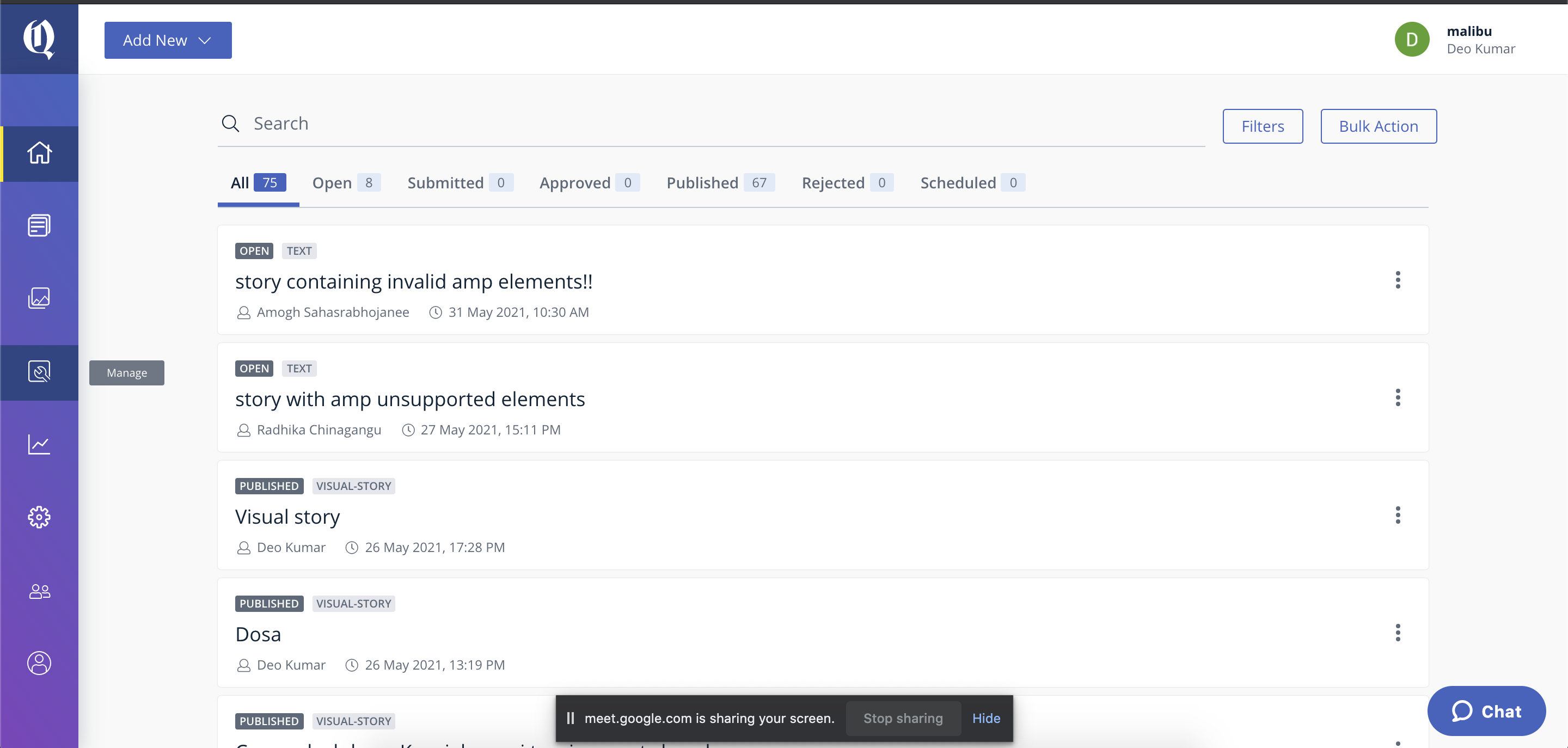
- Click on
Attributesbutton - Click on
Createbutton- Name -
Visual Story Theme - Type -
Story - Data type -
Multiple Values - Multiple values - create three thems :
theme-1,theme-2andtheme-3.
- Name -
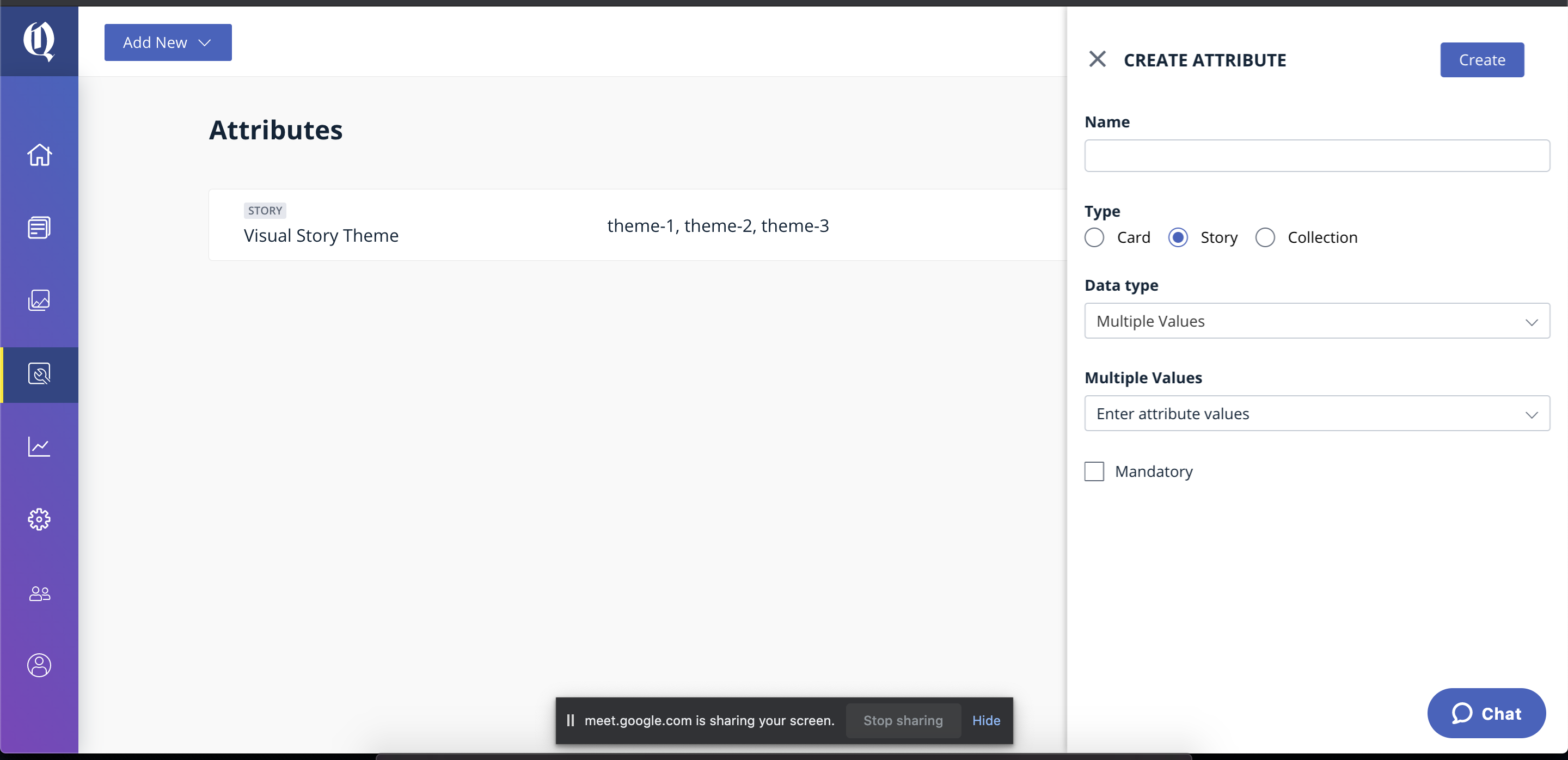
- Click on create.
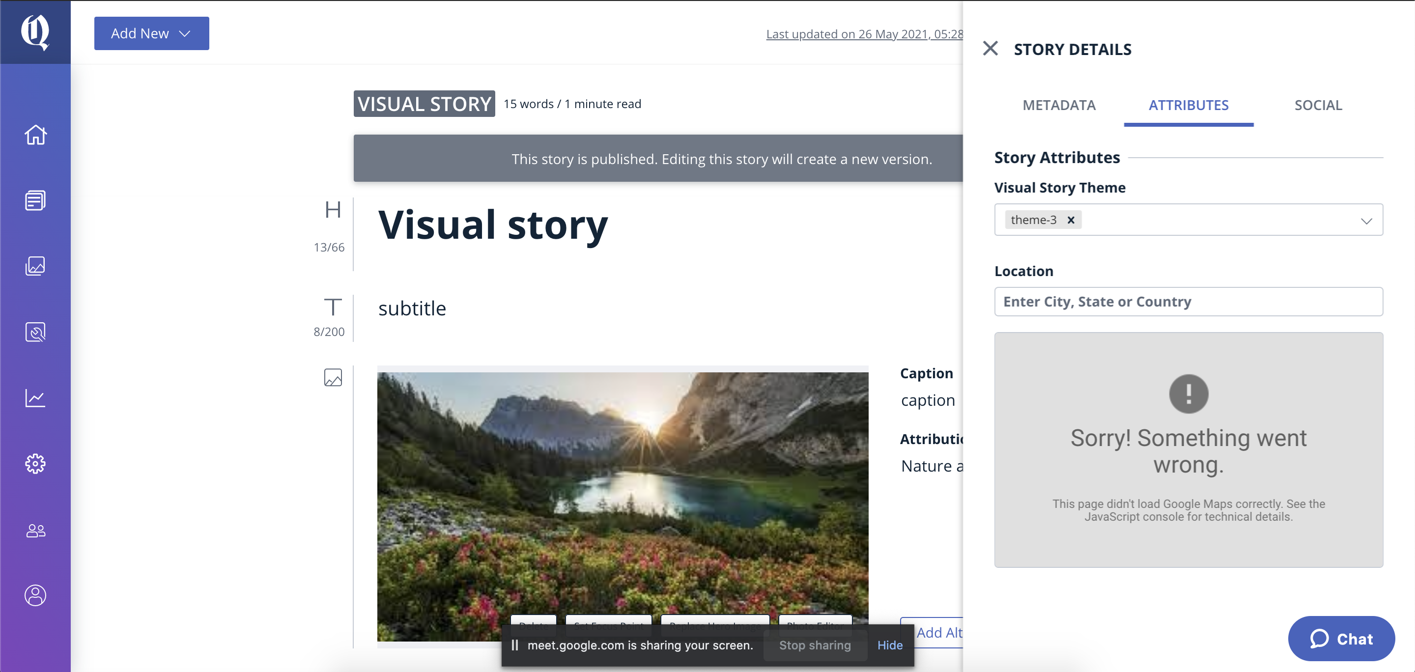
Setting story attributes for visual story
- Click on
Add New->Story: This will open new window withtextstory by default. - Click on
TEXTand select the visual story as template - Click on
Manage->Show Advanced Options->ATTRIBUTES - Select the respective theme which you wanted to render from the story attributes field.
Special note for zoom-in animation effect:
If you've enabled the zoom-in animation effect with a long animation duration, you might have noticed that the grey image background is visible below the image.
This happens when the images used in visual stories aren't of an appropriate aspect ratio.
ampLib has placed a class called qt-amp-visual-story-img-cover on the cover image and qt-amp-visual-story-img on the remaining images. These classes can be targeted via CSS to add styles/css transitions if you wish
Example:
import React, { Fragment } from "react";
import { AMP } from "@quintype/amp";

// pass TopSlot to ampRoutes function
export const TopSlot = (props) => {
  const storyTemplate = props.story["story-template"]
  if (storyTemplate === "visual-story") return <VisualStoryTopSlot {...props} />
  return (
    // your non-visualStory slot logic goes here
  );
};

const VisualStoryTopSlot = ({ story, config }) => {
  const { Head } = AMP;
  return (
    <Head>
      <style>{`
        amp-story-page[active] .qt-amp-visual-story-img > img {
          animation: zoom 10s linear forwards;
        }
        amp-story-page[active] .qt-amp-visual-story-img-cover > img {
          animation: zoom 10s linear forwards;
        }
        @keyframes zoom{0%{transform:scale(1)}100%{transform:scale(1.3)}}
      `}</style>
    </Head>
  );
};
After this, please make sure to disable all the image related animations in featureConfig, since they're now redundant.