Implementing a design system
This tutorial was contributed by Sai Charan
In Malibu, we use the idea of Atomic Design as a part of building a web page.
In this tutorial, we will build a row containing a group of atoms, molecules and organisms all put together.
Basic Terminology
-
Atom - A single and the most basic entity in our system. This can be anything, be it a single image or a simple piece of text indicating a headline/subheadline.
-
Molecules - Group of atoms form a molecule. A combination of an image and a headline can form a card, which is indeed a molecule.
Atom + Atom = Molecule -
Organisms - Group of molecules form an organism. A group of cards can form an organism.
Molecule + Molecule = Organism -
Row - Group of organisms form a row. A couple of card groups arranged in some order can form a row. This can be the highest entity level in our system where multiple rows form a web page.
Organism + Organism = Row
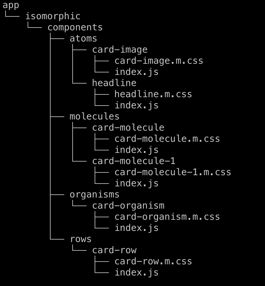
Directory structure
We are going to organize our respective files and folders as follows

Building an atom
Let’s start by building an atom. An atom can be a basic building block. Each atom should be responsible for a single functionality. For example, a CardImage atom should just contain a image. It should not have any text. Let’s build a simple CardImage atom component, which can be used in the future by other components.
import React from "react";
import { ResponsiveImage } from "@quintype/components";

import "./card-image.m.css";

const CardImage = (props) => {
  return (
    <figure className="foo-bar">
      <ResponsiveImage ...{props} />
    </figure>
  );
};

export default CardImage;
This looks something like this,

Let’s also create an another atom component called Headline that can be used while creating molecules.
import React from "react";
import { string } from "prop-types";

import "./headline.m.css"; // include respective css file

const Headline = ({ text }) => <h1>{text}</h1>

Headline.propTypes = {
  text: string
};

export default Headline;
The above atom component just renders a text as a headline.
Combining multiple atoms - Forming a molecule
Now let’s combine the above two atom components to make a molecule. A combination of CardImage and Headline can form a Card.
import React from "react";

import Headline from "../../atoms/headline";
import CardImage from "../../atoms/card-image";

import "./card-molecule.m.css";

const CardMolecule = ({ story }) => {
  return (
      <div className="card-molecule">
        <CardImage card={story['hero-image-key']} />
        <Headline text="Australia thrash Pakistan by 80 runs in 3rd ODI, claim unassailable 3-0 lead." />
      </div>
    </Link>
  );
};

export default CardMolecule;
The above molecule should look something like this

Combining multiple molecules - Forming an Organism
Let’s now add multiple molecules to form an organism, multiple cards can be grouped together to form a molecule.
import React from "react";

import CardMolecule from "../../molecules/card-molecule";
import CardMolecule1 from "../../molecules/card-molecule-1";

import "./card-organism.m.css";

const CardOrganism = ({ collection }) => {
    const collectionStories = collection.items;
    const [firstStory, ...restStories] = collectionStories.filter(item => item.type === "story");

  return (
      <div className="card-organism">
        {firstStory && <CardMolecule story={firstStory} />}
        {restStories.map(story) => <CardMolecule1 story={story} />}
      </div>
    </Link>
  );
};

export default CardOrganism;
Different molecules can also be combined to form an organism. The above organism should look something like this now,

Combining multiple organisms - Forming a Row
Several group of cards(organism) can be combined together to form a row. This is the highest level and multiple rows will finally end up filling the entire webpage.
import React from "react";

import CardOrganism from "../../organisms/card-organism";

import "./card-row.m.css";

const CardRow = ({ collection }) => {
    const collections = collection.items.filter(item => item.type === "collection");

  return (
      <div className="card-row">
        <CardOrganism collection={collections[0]} />
        <CardOrganism collection={collections[1]} />
      </div>
    </Link>
  );
};

export default CardRow;
The above component with respective styling should look something like this.

Hooray! Now we have built an entire row starting from atoms. :)
You may now proceed to Implementing custom SEO logic or jump to a recipe from the Tutorial.