Adding a new component to your home page
This tutorial was contributed by Athira MR
Quintype organizes content using Collections. Each collection can contain stories or other collections, and also contains information required for rendering that collection, such as the “layout”.
In this tutorial we will build a component that can be used on the home page (or any other collection page). In order to do this, the component we create must be compatible with the Collection Component
Creating the Component
For this example we will be creating a new component called TwoColGrid, which is a simple story grid with two columns.
Building the folder structure
We first start by creating the folder structure.
- Create new folder called two-col-grid inside app/isomorphic/components/collection-templates
- Create an index.js and two-col-grid.m.css in above folder two-col-grid
Setting up the HTML
The convention typically followed is to have index.js export the component that is being built.
The simplest way to define the component as a React functional component. The index.js file contains the component, which accepts props as an argument and returns valid JSX.
import React from "react";
import { array, object } from "prop-types";
import { Link, ResponsiveImage } from "@quintype/components";

import "./two-col-grid.m.css";

export function TwoColGrid({ collection, stories, associatedMetadata }) {
  return (
    <div>
      <h3 styleName="heading">{collection.name}</h3>
      <div styleName="wrapper">
        {stories.slice(0,6).map((story, index) => (
          <HorizontalStoryCard story={story} key={`${index}-${story.id}`}/>
        ))}
      </div>
    </div>
  );
}

TwoColGrid.propTypes = {
  collection: object,
  stories: array
};
As you can see, TwoColGrid in turn calls HorizontalStoryCard which is responsible for each card. We will put this component into the same file for now, but do check out the next chapter for a better way to organize this.
function HorizontalStoryCard({story}) {
  return (
    <Link href={`/${story.slug}`} styleName="horizontal-card">
      <div styleName="card-image">
        <figure className="qt-image-16x9" >
          <ResponsiveImage
            slug={story["hero-image-s3-key"]}
            metadata={story["hero-image-metadata"]}
            aspectRatio={[16, 9]}
            defaultWidth={480}
            widths={[250, 480, 640]}
            sizes="( max-width: 500px ) 98vw, ( max-width: 768px ) 48vw, 23vw"
            imgParams=
          />
        </figure>
      </div>
      <div styleName="card-content">
        <h2 styleName="section-name">{story.sections[0].name}</h2>
        <h3 styleName="card-title">{story.headline}</h3>
        <p styleName="author-name">{story["author-name"]}</p>
      </div>
    </Link>
  );
}
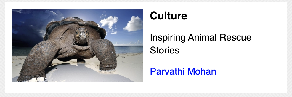
When rendered, HorizontalStoryCard will look like the above picture (though it’s not visible yet!).
Styling the CSS
Let’s fill out the CSS file to style our component. For this component, the styles will come from two-col-grid.m.css.
.heading {
  font-size: 20px;
  text-transform: uppercase;
}

.horizontal-card {
  display: flex;
  background-color: #fff;
  padding: 12px;
  margin-bottom: 12px;
}

.card-image {
  flex-basis: 50%;
}

.card-content {
  padding-left: 12px;
  color: #000;
}

.section-name {
  font-size: 18px;
  margin: 0;
}

.card-title {
  font-size: 16px;
  line-height: 1.4;
  font-weight: normal;
}

.author-name {
  color: blue;
}

@media (min-width: 992px) {
  .wrapper {
    display: grid;
    grid-template-columns:  repeat(2, 1fr);
    grid-gap: 16px;
  }
}
Malibu uses CSS modules by default, which scopes all class names locally. This means a class listed here will not clash with other classes with the same name. For more information, see CSS Modules.
Previewing the Component
After creating the TwoColGrid component, import the component in collection-templates/index.js.
import { wrapCollectionLayout, EagerLoadImages } from "@quintype/components";
import { FourColGrid } from "./four-col-grid";
import { TwoColGrid } from "./two-col-grid"
import React from "react";

...

export default {
  FourColGrid: wrapEager(wrapCollectionLayout(FourColGrid)),
  TwoColGrid: wrapEager(wrapCollectionLayout(TwoColGrid)),
  defaultTemplate: wrapEager(wrapCollectionLayout(TwoColGrid))
};
The functions wrapEager and wrapCollectionLayout provide some utilities for collections.
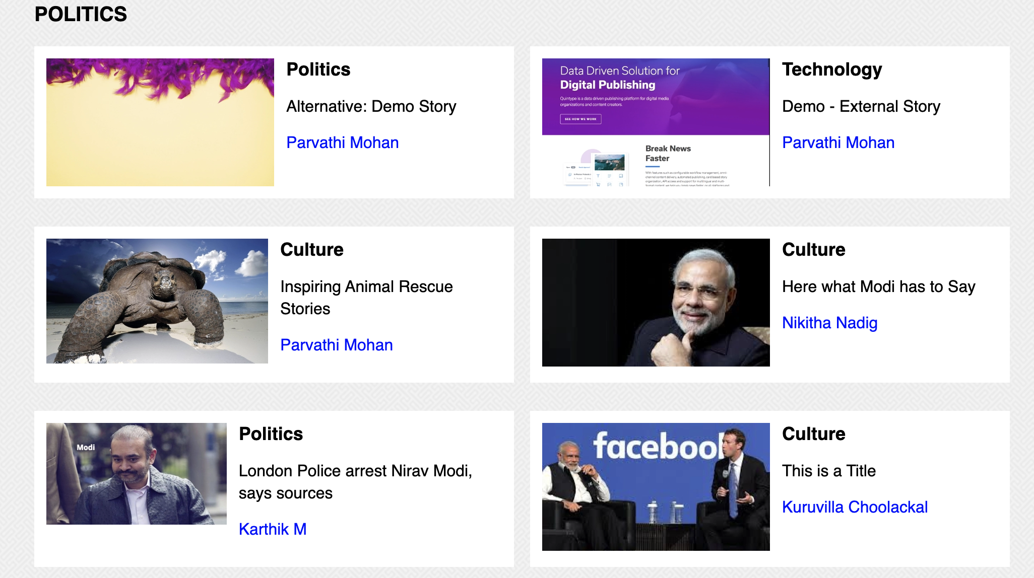
Once this file is saved, you can open a browser, and navigate over http://localhost:3000. You should see your updated component, and it should look like the image above.
Exporting the component to the editor
Now that we have the component working locally, let’s deploy this to a staging environment, and get the our new component to show up in the CMS (under the layout options of the home page).
The CMS picks up the available components by querying /template-options.json on your domain, which in turn reads a list of available components from config/template-options.yml.
Add to template options
config/template-options.yml lists out all the templates which are available to the editor. We first add our new component to this list
collection-layouts:
- name: FourColGrid
  display: Default Malibu Widget
  options: []
- name: TwoColGrid
  display: Two Column Grid
  options:
  - name: color_scheme
    type: string
In the above example, we have added TwoColGrid. We have also requested the editor to show an option for entering “color_sheme”, which is a string. The value entered is currently ignored by our component, but can be accessed via associatedMetadata[“color_scheme”].
You should now see https://localhost:3000/template-options.json updated with the new component.
Deploy the app with black knight
In order to see these changes reflected in the editor, the updated code must be deployed to some environment (such as staging). Please see the Black Knight Tutorial for help on deploying.
Once the deploy has completed, please ensure that you are able to see the template options on your staging instance (https://<your-name>-web.qtstage.io/template-options.json)
Configuring template with Bold
Your template will now be available for configuration on the CMS.
- Go to the editor and find the home collection.
- The home collection usually contains multiple collections, each collection having a layout set via the Manage button.
- Add a collection to the home page, the select the Manage button. You should see the new template in the the drop down list.
- If the value of layout is anything other than the dropdown values, it will fall back to the default layout. You can use this behaviour to test our new collections locally.
Congratulations, you have now created a new component which can be used across any collection pages, including the Home and Section pages.
You may now proceed to Implementing a Design System or jump to a recipe from the Tutorial.