Metype Integration
This tutorial was contributed by Sai Charan
Metype provides a commenting system for users to engage with the content. It integrates as an iframe that can be embedded in a story for comments, as well as feeds for recent comments which can appear as a sidebar.
In order to use metype with malibu, we can use metype-react, a react component to embed metype widgets.
Before getting started, please ensure that the domain you are currently working on (both localhost and the staging domain) is whitelisted in your metype configuration.
Integrating Metype Comments
In our app/isomorphic/components we create metype-comments/index.js, that exports the metype commenting widget.
import React from "react";
import { connect } from "react-redux";
import { MetypeCommentingWidget } from "@metype/components";
import get from "lodash/get";

const MetypeCommentsBase = ({ metypeConfig = {}, story }) => (
  <div>
    <MetypeCommentingWidget
      host={metypeConfig["host"]}
      accountId={metypeConfig["accountId"]}
      pageURL={story.url}
      primaryColor="#eeeeee"
      className="metype-comments-widget"
    />
  </div>
);

const mapStateToProps = state => {
  return {
    metypeConfig: get(state, ["qt", "config", "metype"], {})
  };
};

const MetypeComments = connect(mapStateToProps)(MetypeCommentsBase);

export default MetypeComments;
Why do we need the wrapper component?
We need the wrapper component in order to get the metype configuration (including the metypeHost and metypeAccountId). These values come from config/publisher.yml.
publisher :
  metype:
    host: "https://staging.metype.com"
    accountId: "1"
The above file can be edited and updated in black knight’s respective publisher’s config file.
Passing the new configuration to MetypeComments
The publisher config value can be fetched from quintype/framework’s publisher-config. Once the value is fetched, we need to add it to the config in app/server/load-data.js.
Our app/server/load-data.js loadData will get amended to look something like this.
import config from "@quintype/framework/server/publisher-config";
...
export function loadData(....) {
    ...
    return {
      ...,
      config: {...config, metype: config.metype || {}},
    };
}

export function loadErrorData(....) {
  return Promise.resolve({
    ...,
    config: {...config, metype: config.metype || {}},
  });
};
Adding the component onto the story page.
Finally, we add the component onto the story page. Let’s add this to the end of the story page. Here, we append to the BlankStory component, found in app/isomorphic/components/story-templates/blank.js.
...
import MetypeComments from "../metype-comments";
...

function BlankStory(props) {
  return (
    <div className="story-grid">
      <BlankStoryTemplate story={props.story} />
      <MetypeComments story={props.story}/>
    </div>
  );
}
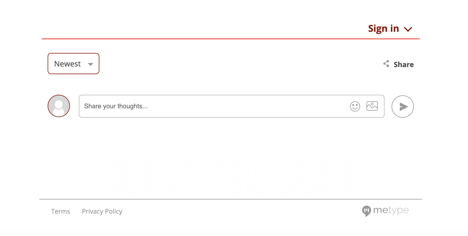
Seeing it live
Navigate over to any story page, and you should see a commenting widget like the one below.
Integrating the Feed Widget
The Metype feed is a widget that gives a list of updates that are happening on the metype commenting widget across the publisher.
Since the feed has to be across all the pages in the website, it is rendered as a part of preRenderApplication alongside Header, Footer and BreakingNews components.
In our app/isomorphic/components we create metype-feed/index.js, that exports the metype feed widget.
import React from "react";
import { MetypeFeedWidget } from "@metype/components";
import { connect } from "react-redux";
import get from "lodash/get";

function MetypeFeedBase({ config = {} }) {
  return (
    <div className="metype-feed">
      <MetypeFeedWidget
        host={config["metypeHost"]}
        accountId={config["metypeAccountId"]}
        primaryColor={config["primaryColor"]}
        className={config["className"]}
        secondaryColor={config["secondaryColor"]}
        publisher={config["publisher"]}
      />
    </div>
  );
}

function mapStateToProps(state) {
  return {
    config: get(state, ["qt", "config", "publisher-attributes"])
  };
}

export const MetypeFeed = connect(
  mapStateToProps,
  null
)(MetypeFeedBase);
The respective config data can be fetched like mentioned above
Adding the component across the publisher.
Since the feed widget is rendered on the server side, we add it as a part of preRenderApplication in app/client/render.js.
...
...
import { MetypeFeed } from "../isomorphic/components/metype-feed";

export function preRenderApplication(store) {
  ...
  renderComponent(MetypeFeed, "metype-feed", store);
  ...
}
Since we have given metype-feed as the target container, we need to add this <div> in views/pages/layout.ejs
<!DOCTYPE html>
<html>
  <head>
    ...
    ...
    ...
  </head>

  <body>
    ...
    ...
    <div id="metype-feed"></div>
    ...
    ...
  </body>
</html>
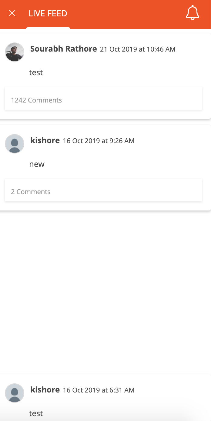
Seeing the feed widget live
Navigate over to any page, and you should see a feed widget like the one below.
On the right side of the page, you can see a small logo indicating the feed,
Once clicking the feed icon, you can see the list of updates as the feed,
You may now proceed back to the list of Tutorials.